El Buen Fruto

OVERVIEW
The idea of El Buen Fruto was born after knowing the big problem that all the farmers in Mexico have with the distribution chains. I decided to create this company together with my partner Eduardo Méndez so that we could help Mexican beekeepers to shorten their distribution chain and add value to their products with the help of design and technology.

This is how El Buen Fruto began. A company dedicated to the national commercialization of honey, supporting in a close and personalized way the small producers that normally live in situations of economic insecurity, whether they are family businesses, cooperatives or independent producers.

Research

Almost 40% of the honey is produced in the states of the Yucatan Peninsula. Mexico City and the states of Chiapas, Baja California Sur, Guerrero, Colima, Jalisco, Nayarit, Chihuahua, Nuevo Leon and Veracruz. This economic activity benefits more than 40,000 honey producers. Mexican beekeeping generates foreign exchange for 56 million dollars annually.

Export destination

Currently, the main export destination is the European Union, where Germany accounts for about 55% of our total exports.

Distribution chain

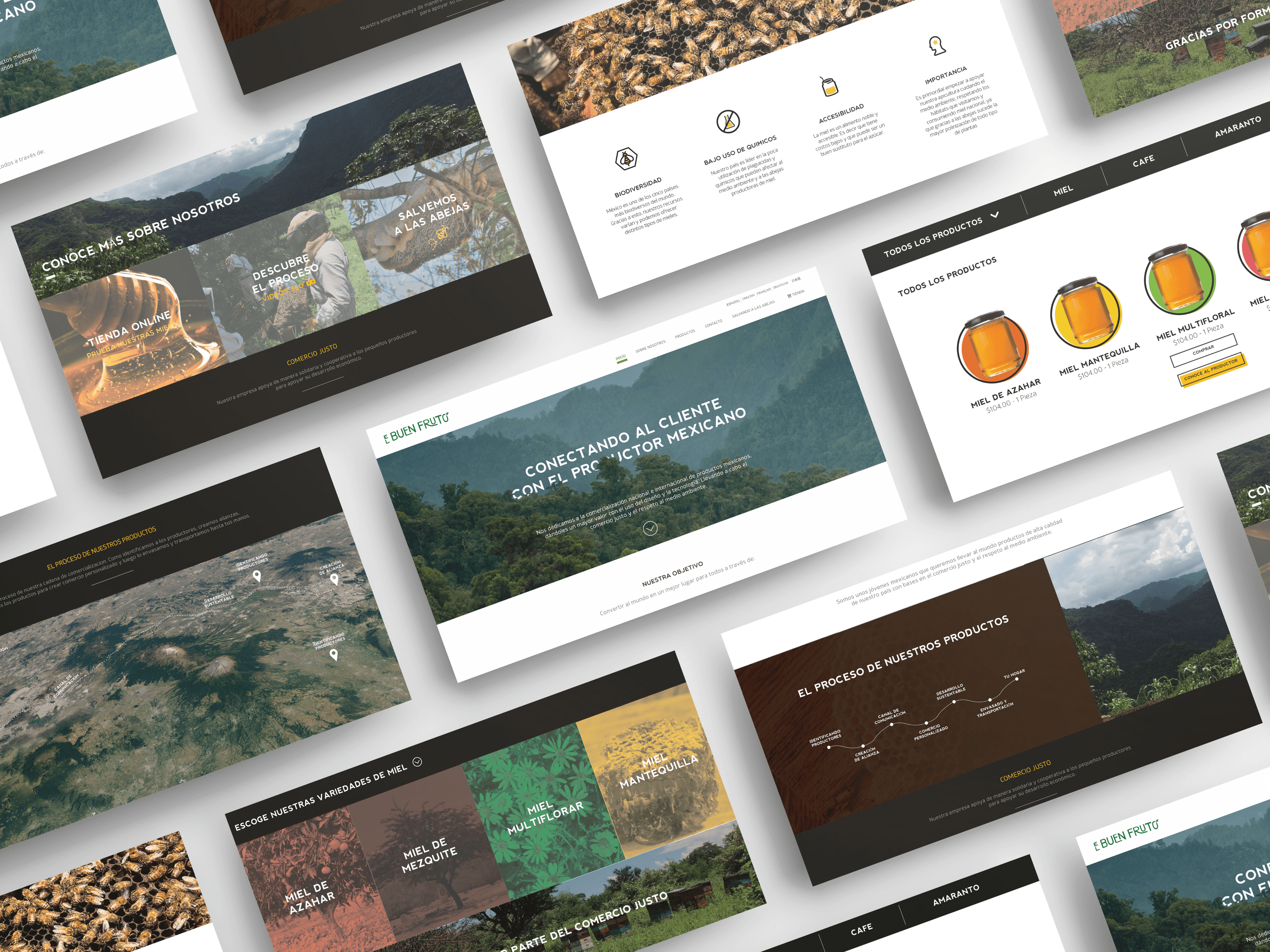
We wanted to revolutionize the kind of commerce that is currently being done by connecting the producer with the final consumer through the use of design and technology. We knew that the consumer was interested in retaking the link he had with the producers, where thanks to him, he could know the characteristics, history and information of the products.

Business strategy

The business strategy to position the brand in the national market was first to satisfy the customer through accessible prices, innovative design and an eco-friendly quality product.
BRANDING

Brand identity

The Brand
For the design of this label we decided to use Mexican techniques, colors and designs without falling into anything hackneyed either. The purpose of this branding was to be able to reflect a little bit of the field in the daily life of the users, to become a window for both sides to interact.
Logo
The logo is changeable, like nature. It is made of shapes that are neither straight nor geometric, since such familiar shapes to us like lines are rarely found in nature.
DESIGN SYSTEM

Typography
& Colors

Since our objective was to give value to the product with the use of design and technology, all information should be as clear as possible and transparent. In order not to detract from the visuals we would use, the following typographies were chosen

Aa

Lato

A B C D E F G H I J K L M N O P Q R S T U V W X Y Z
a b c d e f g h i j k l m n o p q r s t u v w x y z

Aa

Playfair Display

A B C D E F G H I J K L M N O P Q R S T U V W X Y Z
a b c d e f g h i j k l m n o p q r s t u v w x y z

# FFFFFF

Background color

# FFFFFF

Background color

# FFFFFF

Background color

# FFFFFF

Background color
DESIGN

Web

Click Stream Data

It is the process of collecting, analyzing and reporting aggregate data about the process and order in which you visit a website or application. With clickstream Analysis we can identify a problem, but only qualitative analysis and user testing will explain the reason for the user's behavior.

In this case we did user tests using this technique to identify if it was easy for users to follow a series of tasks and to navigate from one section of the page to another, these graphs let us know how intuitive the page is and where users have difficulty navigating
DESIGN

App

Augmented reality

In order to connect the producers with the final user we decided to use augmented reality. The users will download in their mobiles our App, they will scan the label and they will see an interesting animation of a bee flying through the Mexican jungle towards its beehive.

After this, they will be able to see a 360 video where the beekeepers explain the process of the honey and how this product arrived from the field to their hands.

360 Video

We created this 360 video, which users can access through the website or by scanning their honey packaging. This video is recorded in the field where the honeycombs are located and explains in detail how the honey from the countryside came into your hands.
BRANDING

Packaging

Labels
We decided to collaborate with the great illustrator Tabatá Bandin in Mexico City to create these labels, each label has an illustration with flowers from where bees collect the pollen to create honey. It gives a Mexican and artisan touch to our product.

Results

After a year of hard work we were able to finish this project with the help of a great team of programmers, animators, illustrators, lawyers and more. While working on this project, I had great experience to practice my teamwork, collaboration, and accountability skills. I learned that dividing the workload and owning a part of the project is a key to productivity. Also, I was once again reassured that user testing and iteration will always deliver positive results.

Let's Connect

Reach out for any question, collaboration or just to say Hi!
2022 All rights reserved - Designed and developed by Enrique Hinzpeter